
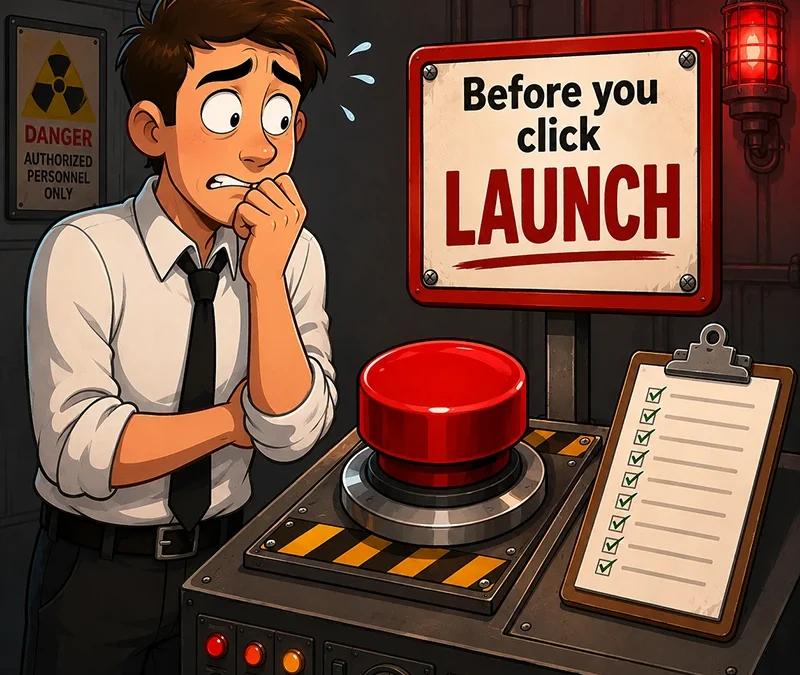
Before you do, I need you to do something. It’ll take five minutes. Maybe less. And it could save you a lot more than five minutes’ worth of ad spend.
Because here’s what happens more often than it should.
A business runs ads. The ads work. People click. Traffic arrives. And then… nothing. No enquiries. No sales. Just a spike in visitors and a dip in the bank account.
The ads weren’t the problem. The website was. You were paying to send people to a leaking bucket.
Five minutes before you spend a penny on ads could save you hundreds. Maybe thousands. Here’s what to check.
1. Above the Fold
Does it immediately tell the visitor what you do and why it matters?
If they have to scroll to find out, most of them won’t. They’ll leave. You’ve got about three seconds before someone decides whether to stay or go. If your hero section is a nice photo and a vague tagline, you’re done before you’ve started.
2. The Call to Action (CTA)
Not three options. Not a buried button somewhere below the fold. One obvious action.
“Get a quote.” “Book a call.” “Shop now.”
If visitors have to think about what to do next, they won’t do anything.
Conversion isn’t about how the site looks. It’s about what the site says, or sometimes doesn’t say, and whether that matches what your visitor needs to hear at exactly the right moment.
3. Page Speed
If it’s below 70, you’re paying for clicks that bounce before the page even loads.
People don’t wait. Especially on mobile. Especially when they’ve just clicked an ad and have no loyalty to you yet. A slow site is an invisible wall between your ad and your conversion.
4. Trust Signals
Are they visible without scrolling? And do they actually mean anything?
A row of logos from companies no one’s heard of doesn’t build trust. A testimonial that says “Great service, would recommend” doesn’t either. Specifics build trust. Results build trust. Real names and faces build trust.
If your trust signals are buried at the bottom of the page, they’re not doing their job.

5. Message Match
Do they say the same thing?
If your ad promises “Free delivery on all orders” and your landing page doesn’t mention it, that’s a gap. If your ad talks about a specific product and your landing page is your homepage, that’s a gap too.
Every disconnect between what the ad says and what the page says creates doubt. And doubt kills conversions.
6. Mobile Experience
Not a desktop preview. Not a simulation. Your actual phone.
Most ad traffic is mobile. If your site looks great on desktop but cramped, slow, or awkward on mobile, you’re losing the majority of your clicks before they even have a chance.
Tap the buttons. Fill in the form. Go through the experience as if you were a customer. If anything feels clunky, fix it.
7. The Form or Contact Path
Every unnecessary field loses people. Every extra page loses people. Every moment of friction loses people.
If you’re asking for a phone number and they don’t know why, they’ll leave. If your checkout has six steps when it could have two, they’ll leave. If the “Contact Us” button leads to a page with no form and just an email address, some of them will leave too.
Make it easy. Easier than you think it needs to be.
None of this is complicated…
Five minutes. That’s all it takes to spot the obvious problems. The ones that are quietly draining your ad spend every single day.
If you’d like a second pair of eyes on your site before you run your next campaign, that’s exactly what I do in a Revenue Leak Fix Session. A focused look at where your website is losing you money and what to fix first.
Recent Comments