
The answer might surprise you.
What is “Above the Fold”?
On your website, it’s the same idea. Above the fold is whatever is visible on screen the moment someone lands on the page….before they scroll. And everything below that line? A large chunk of your visitors will never see it.
What the data actually shows
To understand how this plays out in practice, it’s best to look at a scroll map. The example I use in this video is Microsoft Clarity which is a completely free heatmapping tool, which shows you what visitors are actually doing on your site.
The scroll map view uses colour to show how far visitors are scrolling: red and orange at the top where everyone is, fading to blue as you move down the page.
The tool shows the average fold line, which sits roughly where the average visitor’s screen ends. And what happens just below it is striking.
At the average fold line, we’re already down to around 50% of visitors. Half your visitors aren’t seeing anything below that point. By the bottom of a typical homepage, fewer than 10% of visitors ever make it that far.
So if your most important content – for example your main offer, your key product, your strongest reason to buy, your social proof – is below the fold, the majority of your visitors are never going to see it.
That’s not a traffic problem. That’s a layout problem.
The device problem (most people miss this)
What’s above the fold on a desktop monitor is not necessarily the same as what’s above the fold on a phone. The average fold line on desktop sits much lower down the page than it does on mobile, which means content that looks perfectly placed on your desktop preview could be completely hidden from mobile visitors.
And if most of your traffic is mobile – which for most websites it is – then you need to be thinking about the mobile fold, not the desktop one.
The tool here, Microsoft Clarity lets you switch between device views, and the difference can quite often be eye-opening.
What should be above the fold?
Three things, minimum:
What product/service you sell – in plain language. Not a brand tagline. Not an aspirational statement. What you actually sell. A visitor should be able to tell within three seconds of landing on your homepage exactly what you offer.
Why they should buy from you – your key differentiator. What makes you the right choice over anyone else? This needs to be visible immediately, not buried halfway down the page.
A clear next step – a call to action (CTA). What do you want them to do? If that action isn’t obvious above the fold, you’re leaving the decision entirely to chance.
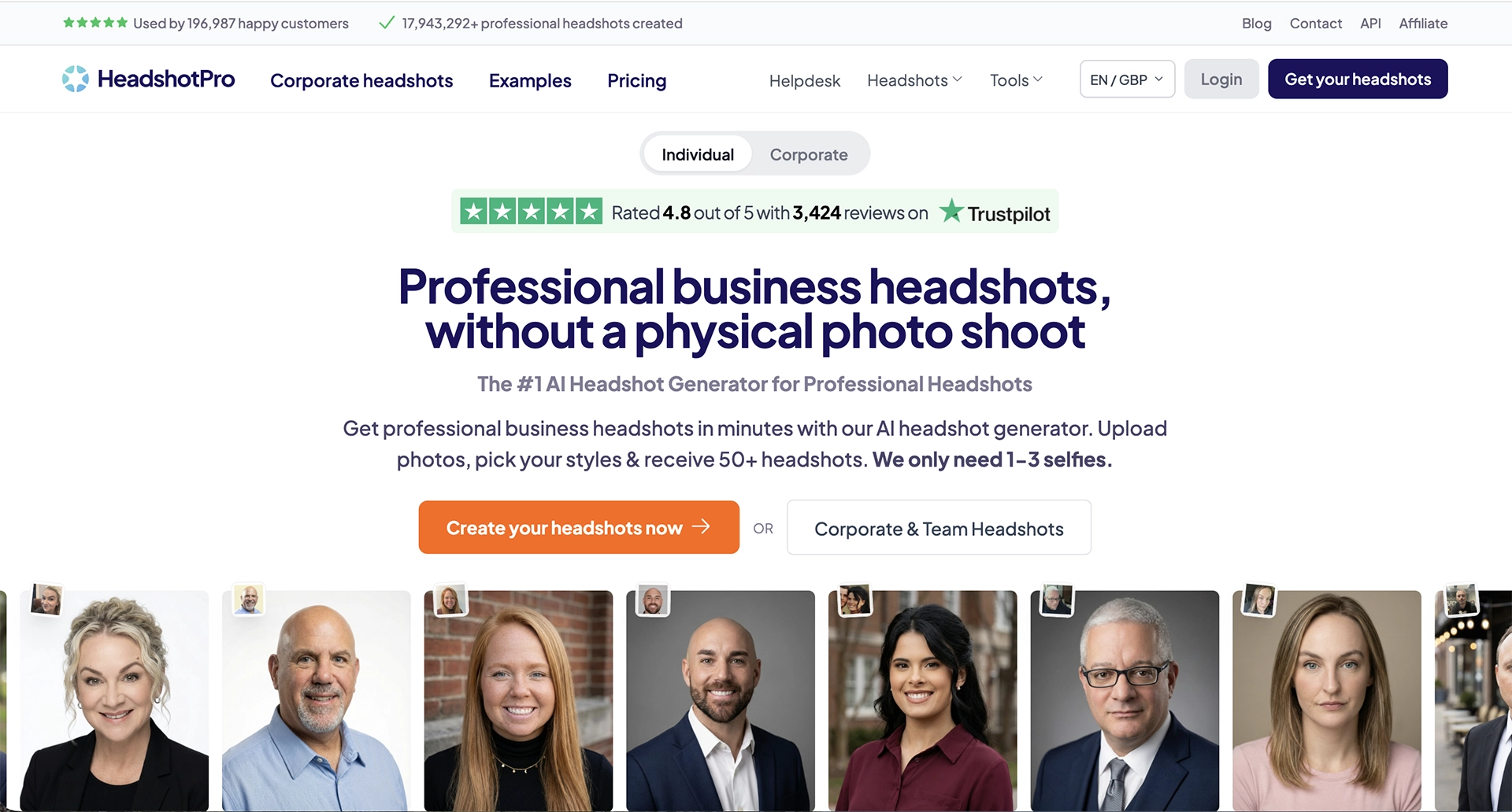
A good example of a site that gets all three right is Headshot Pro. The moment you land, you know what they sell, why they’re different, and exactly what to do next. No scrolling required to understand the offer.
A bonus thing to get above the fold? Social proof…testimonials or reviews. Check out Headshot Pro again, yep they’ve got social proof above the fold as well.
The two homepage mistakes that cost the most
The oversized hero image
The most common thing I see on website homepages is a large, beautiful hero image… lifestyle photography that takes up the entire screen.
The brand looks great. But the actual message- the reason to buy, the offer, the call to action – is either buried in tiny text underneath it or pushed below the fold entirely.
Your homepage isn’t a billboard. It’s a sales page. Looking good and converting are not the same thing.
The rotating banner
If that hero image is cycling through multiple messages, you’re gambling on which one a visitor sees. Most people don’t wait for the rotation. They see slide one and make their decision. Slides two, three and four are invisible.
We covered this in our look at the Three Store website from 2008. We had four rotating offers and found that visitors were only ever really seeing the first one. The rest were wasted space dressed up as choice.
Pick one message. Commit to it.
The question to ask yourself right now
Go to your own homepage. Look at it honestly (don’t forget…on your phone as well as your desktop!)
Is your most important message above the fold?
Is it clear what you sell, why you’re the right choice, and what to do next…all without scrolling?
If the answer is no, that’s your starting point.
Not a new ad campaign. Not a redesign. Just moving the right content to where your visitors can actually see it.
If you want me to answer that question for your website specifically, the button below is a good place to start.
Recent Comments