
And it’s doing things that a lot of eCommerce stores still aren’t doing in 2026.
I know, because I was there. I was part of the team that built and optimised it…and I’ve spent nearly 20 years since then watching eCommerce brands struggle with the same things we were solving back then.
This is the Three UK Store. What follows is an honest account of what we got right, what we got wrong, and what it still means for your store today.
The Homepage
What we got right…
Navigation
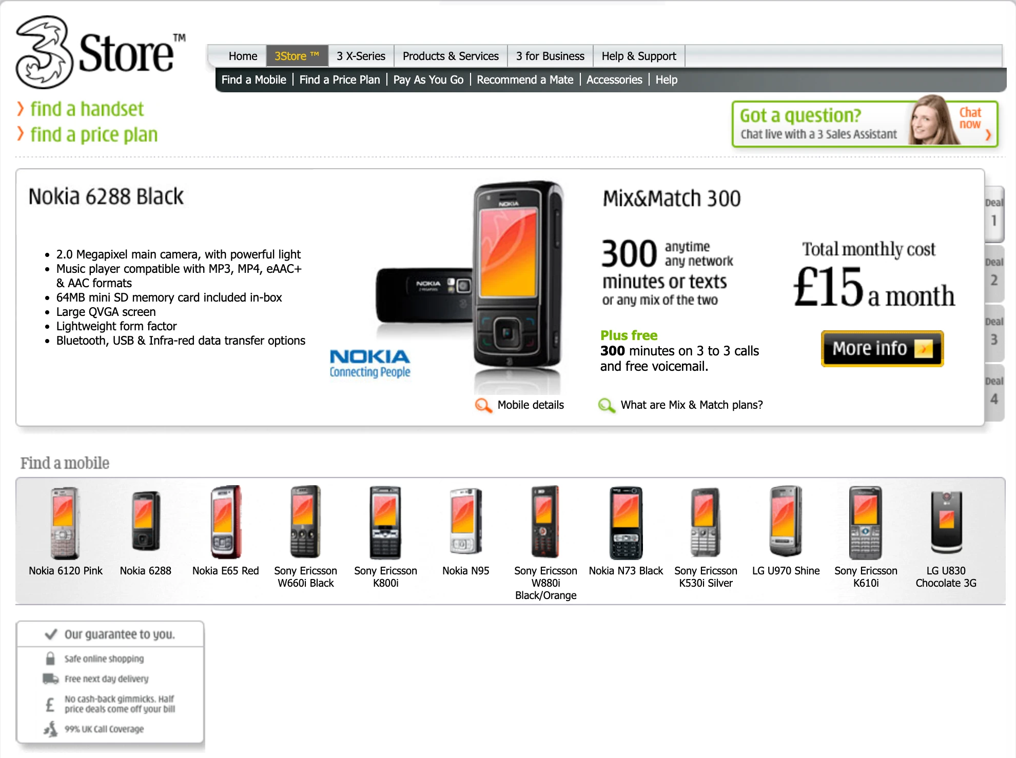
Find a handset. Find a price plan. The two clear, main links.
We knew from our analytics and knowledge of the market that a large chunk of our visitors were handset-driven. They were coming looking for a specific device.
But a secondary group had a budget in mind, or needed a certain number of minutes or texts, and were therefore looking for a price plan to fit it. So we built the navigation around those two jobs, and we kept a close eye on the clicks to update it accordingly.
The lesson holds today: your ecommerce navigation should be built around what the customer is looking for. All the data you need to figure that out is already in your analytics.
Live Chat
We made the Live Chat button as prominent as possible, and we had a real person in a team at the other end.
We knew that buying a phone contract was a considered purchase. People had questions. They needed reassurance.
However, what made us double down on this was the data: visitors who used web chat were 25% more likely to convert. They could overcome their questions or concerns quickly, and then complete their purchase. Making that help impossible to miss wasn’t just good UX, it was a revenue decision.
Featured Deal
One phone. One plan. Clear benefit. Clear price. Single call to action.
We made a deliberate choice about what we most wanted to sell, usually based on what was popular in terms of both handset and price point, and we committed to it.
The temptation with a homepage is to show everything and hope something lands. What actually happens is you end up selling nothing. We were keen to avoid that trap.
The “trust block”
Safe online shopping.
Free next day delivery.
No cashback gimmicks.
99% UK call coverage.
Four specific claims. Not vague reassurances, actual answers to the concerns people had about buying a phone contract online. And at that time, many customers were still used to doing this in store.
Every one of those trust signals was there because we knew it was a question in the customer’s head.
What we got wrong…
The deal tabs
On the right side of the homepage, we had four deal tabs. Deal 1, Deal 2, Deal 3, Deal 4.
We thought we were being helpful, give them all the options.
What we actually learned was that Deal 1 got almost all of the attention. Deals 2, 3 and 4 were effectively invisible. We were creating an illusion of choice while diluting the one deal that actually mattered. This has been confirmed by research many times since. We probably wouldn’t do that again.
The phone catalogue
Below the main deal, we had 13 handsets with no hierarchy. Given that many of our visitors were handset-driven, the instinct to show the range made sense…but in practice it was too much of a distraction.
What we could have done better was to make that section less of a detour and more of a deliberate next step, or used filters to make choices based on the customer’s preferences.
The Deal Summary Page
Any significant drop-off here indicated a real problem, and we monitored it closely.
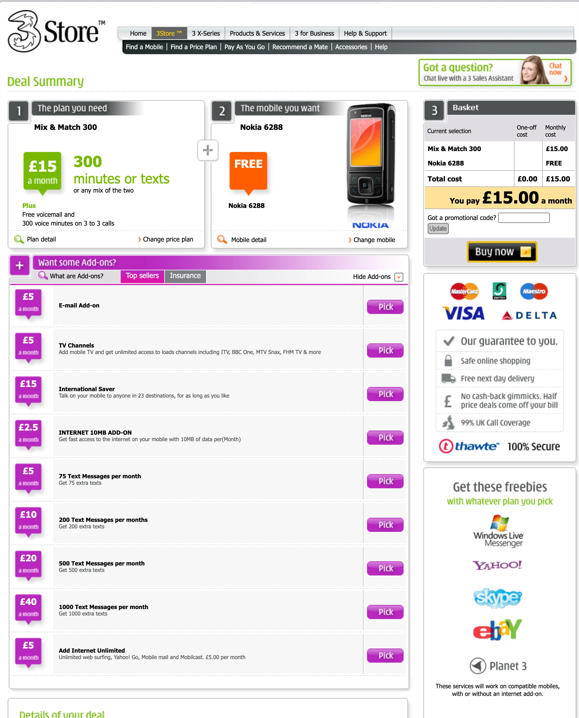
Step 1, Step 2, Step 3. We were deliberate about this.
Buying a phone contract in 2008 felt complicated to a lot of customers. They’d been burned by hidden costs and confusing terms. Showing them exactly where they were in the process, and how many steps remained, was a direct response to that anxiety.
Many checkouts still don’t do this properly eighteen years later.
One-off cost and monthly cost laid out clearly.
Total: £15 a month. No surprises.
And the amber box directly above the Buy Now button, that was deliberate.
We wanted zero ambiguity at the moment of commitment. If a customer had any doubt about what they were agreeing to, we’d failed.
We tested this section extensively. Small changes here had a material impact on conversion.
We needed to upsell, monthly recurring revenue was a big thing. So selling email add-ons, TV channels, extra texts was important, but we were very conscious of not making this part of the process feel like a gauntlet.
We made the add-on selection opt-in, clear and easy to use. And collapsible if someone just wanted to get on with the purchase without the noise.
The principle: offer the upsell without ambushing them with it.
The “trust stack”
Payment logos, guarantee checklist, security badge – all positioned right next to the Buy Now button. This was deliberate for the moment of maximum purchase anxiety, where the customer is about to hand over their card details.
The freebies underneath (Skype, eBay, Yahoo… very 2008) look dated now, but the principle holds: add perceived value at the moment of commitment.
The Cashback Gimmick
Remember that trust signal “No cashback gimmicks”? That was only added because of what the rest of the market was doing.
Newspaper ads at the time would show the same £15/month deal for something crazy like £1.99/month. Sounds incredible right?
In reality, you paid full price, then had to claim cashback….and with a lot of hoops to jump through. You had to send copies of every single bill, in a specific window, in a specific format. Miss one bill and you got nothing. It was designed to fail.
Phone dealers were using their commission to drive volume, which worked for them, but only if you understood the risks going in.
We made a deliberate decision to name it. Not just to avoid doing it ourselves, but to call it out explicitly as a reason to choose us. We were effectively more expensive, and we told customers that upfront. When we ran a half-price deal, it came straight off the bill. No hoops to jump through.
The thing to remember is: if your product is more expensive than a competitor, there’s usually a reason. Help your customer understand that reason. You’re not hiding from the price comparison, you’re reframing it. That’s not just a UX decision. It’s a positioning decision.
What it all means in 2026
Everything we got right on that site…clarity, transparency, reduced friction, a single focused action at every step, is the same thing I look for when I audit a store today.
The technology is unrecognisable. The psychology hasn’t moved an inch.
Customers in 2026 have the same questions, the same anxieties, the same need for clarity that customers had in 2008. We knew it then. A lot of stores still haven’t acted on it.
The question to ask yourself right now
Go to your homepage or your product page.
Ask yourself:
When a customer arrives, do you know what you want them to do? And is it completely clear to them what you want them to do?
Is the navigation journey obvious? Is the call to action unmissable? And can they resolve any concerns or questions without having to hunt around, which then might distract them from making the purchase?
If you want me to answer that question for your store specifically, the button below is a good place to start.